Project description
Originary from Newry, Northern Ireland, The 4 Of Us are a rock band are best known outside Ireland for their success in the late 1980s and early 1990s.
In 1989, the single “Mary”, from the first The 4 Of Us album, “Songs for the Tempted”, have been one of the most played songs on Irish radio. They got double platinum in Ireland for this album and won Best Album of the Year at the Irish Music Awards, defeating the internationally known act U2.
In 1992, the album “Man Alive” helped The 4 Of Us to enter the UK charts for the first time, with the single, “She Hits Me”.
Of the four founding members, only brothers Brendan and Declan Murphy have remained continuously part of the group.
In April 2016 I was commissioned to create their new logo, for the new The 4 of US album. This logo had to be used in their future branding materials for print and web.
In the briefing Brendan and Devlan mentioned that they will need a logo that will have to be:
– a classic and stylish
– clean and simple
– strong and subttle
– different from the previous logos The 4 of Us
– friendly as tonality
– premium to luxurious felling
“Rebranding your company to have its own voice, look, and feel will help establish your business as an industry leader with a personality that appeals to your audience.”
After 3 week of works and different proposals presented and last touches we end up with a wordmark logo the is:
Clean and very simple through its lack shapes and symbols, but that express strongness through the all in caps letters, but with thin letter shapes. I was asked to not emphasis the importance of the number 4, as in the older version, to better express the idea of unity and equality, values that represent the rock band.
Also through the large round shapes of the letter, I successfully was able to make this logo to be perceived as a having a friendly tone.
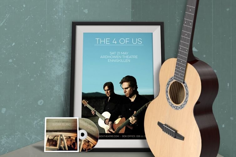
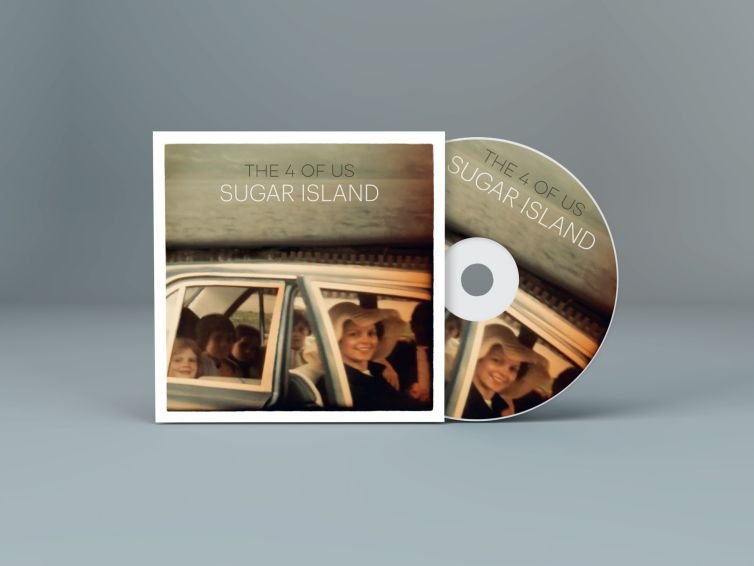
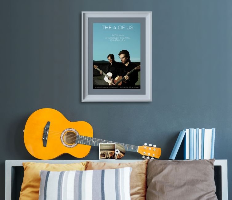
This project was a success and later that year, THE 4 OF US have launched their new album, “Sugar Island”, with the new logo on it. Also, the new logo was used since than on their website, flyers and others promo materials for print and web.
A graphic description of Sesomo branding.